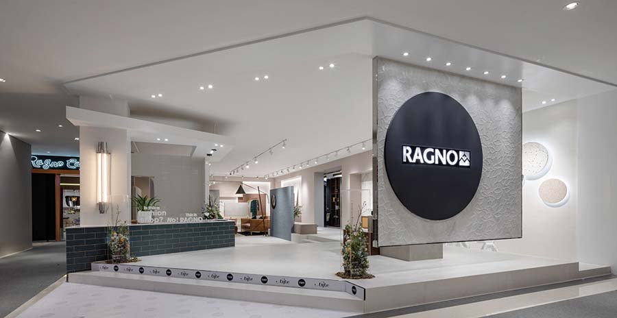
The majority of interior space of tiled exhibition hall on the market has overly complicated generatrix, too many displays and obsolete samples, so that “balance” becomes the most important theme in our design, which means the combination of tender humanity design and different individual experience. Thus, we intended to organize the whole space with simple and open generatrix. It won’t set a fixed shopping route for customers in advance because we hope to offer a free choice for customers in shopping experience. Through the guidance of different layers of colors and textures, the customers can find out their favorites during exploring.
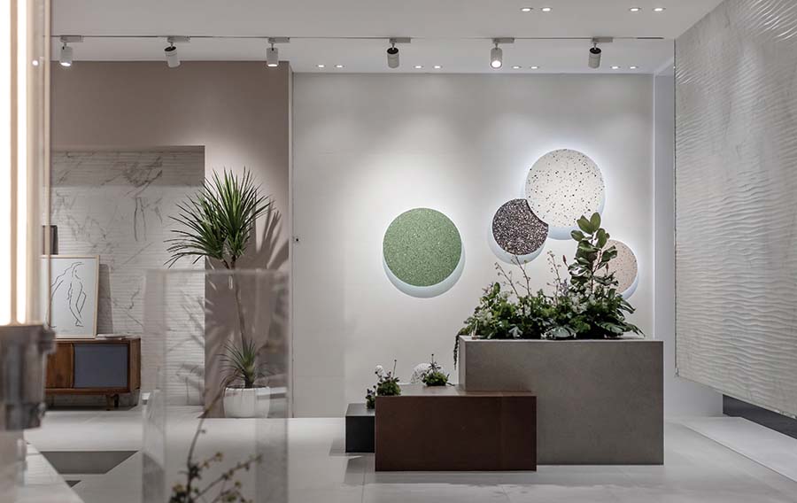
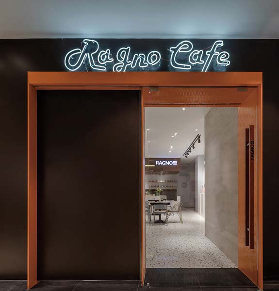
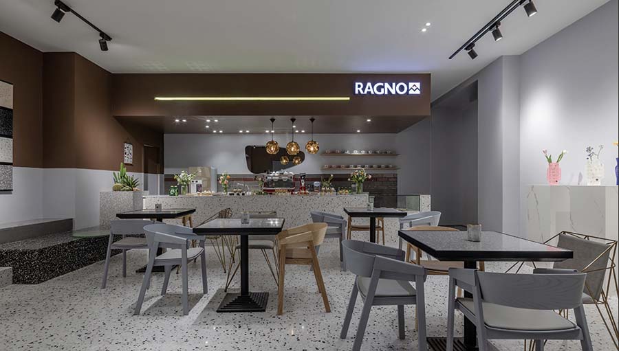
The exterior of this exhibition hall is a total open space without any doors and dazzling array of display windows, so you can almost see through the entire exhibition with your own eyes. The oblique entrance attracts people from both sides naturally. The white bricks with stone-like texture suspended on top is the best-selling product in RAGNO, matching with round glowing logo, it becomes our most suitable wall for display.
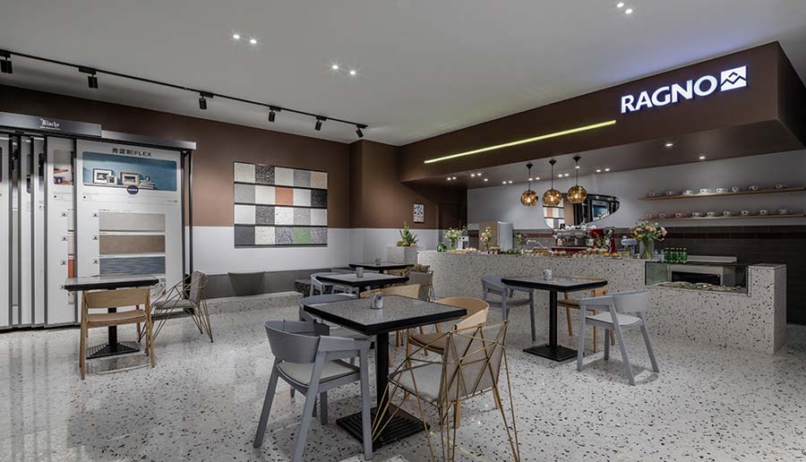
We use some concepts of designing a clothing store for reference, and we expect a multi-dimensional display of different colors and textures of glazed tiles applied. They could be insertions of blocks, backgrounds of displaying, or a surrounding space of a sunken plaza. The simple division of space not only add fun to customer’s interaction with the area, but also give them a brand-new experience of shopping. In addition, plants, flowers, coffee and different styles of furniture and lamps added to this space reveal our expectation of combining aesthetics of everyday life with the exhibition hall, so that we can bring vigor and vitality to RAGNO naturally, and make it real space of living.
한상록
저작권자 ⓒ Deco Journal 무단전재 및 재배포 금지


0개의 댓글
댓글 정렬